UI/UX Design · iOS App Concept · 2026

Clara

Group trips don't fall apart because people stop caring. They fall apart because responsibility becomes impossible to see. Clara makes ownership the one thing you can't miss.

Explore interactive prototype

Role

Solo end-to-end. Research, problem framing, IA, interaction design, usability testing.

Context

Eight-week BrainStation project.

Tools

Figma. Methods: qualitative interviews and survey, task-based usability walkthroughs.

Deliverable

Interactive iOS prototype.

Clara iOS app — trip planning dashboard showing task ownership and progress

The Problem

When ownership goes invisible.

Group trips rarely fall apart because people stop caring. They fall apart because responsibility becomes impossible to see. Planning spreads across chats, notes, and spreadsheets. Tasks are discussed, but rarely assigned or tracked in one place. Over time, one person fills the gaps—following up, confirming details, carrying the coordination load.

It's not a motivation problem. It's a visibility problem.

It's not that people don't want to help, it's that by the time we're in the group chat, no one knows who's doing what anymore.

— Research participant

Design challenge: How might we make task ownership continuously visible so that coordination is shared rather than absorbed by one person?


Key Insight

Responsibility doesn't disappear, it becomes invisible.

I conducted three in-person interviews and a survey with frequent group trip planners. The pattern was consistent across all six participants: tasks were discussed and informally acknowledged, but ownership was never made explicit. Without a shared record, people defaulted to assumptions, and one person defaulted to managing everything.

This shifted the project's direction. The problem wasn't that groups lacked planning tools, they had plenty. The problem was that none of those tools surfaced who owned what right now at a glance. The design needed to make responsibility visible at a glance, not retrievable after digging.

Before

A feature problem: add more planning tools

After

A visibility problem: make ownership impossible to miss

View research insights in Figma
Thematic analysis from user interviews
Thematic analysis from user interviews.
Maya — the friend who often becomes the default trip planner
Meet Maya: The friend who often becomes the default trip planner, built from interview findings.

Product Strategy

Ownership as the organizing principle.

Tasks became the core unit. The product is built to surface them, who owns what, what’s done, and what’s pending, without requiring follow-up.

Feature What it does
Shared Trip Dashboard Single view of all tasks: status, owner, deadline
Task Assignment Name the task, assign an owner, set a due date
Progress Indicators Visual status per task and per trip overall
Trip Setup Flow Invite friends and set trip details before tasks are created
View exploratory sketches
Early Clara sketches exploring different ways to surface task ownership
Early sketches explored different approaches to surfacing task ownership.
Final prototype: trip creation, shared dashboard, and task assignment flows.

Design Decisions

Three decisions that shaped the product.

01

Task list over timeline

The goal is to see who owns what now. A timeline suggests sequence, but obscures responsibility; a task list makes ownership explicit.

Tradeoff The tradeoff is visual simplicity. The interface is less expressive, but more direct.
02

Ownership is mandatory

Every task requires an owner at the moment of creation, because an unassigned task is just the original problem with a due date attached.

Tradeoff It creates friction during early, generative trip planning when roles aren't yet clear. Some users pushed back in testing. My current answer is that a little friction early is worth a lot less confusion later, but this is where a "needs owner" buffer state would help.
03

Labels & icons for task status

Testing showed that icons alone made users pause. When clarity is the core promise of the product, the interface can't ask people to decode it.

Tradeoff Text takes more space, but removes hesitation.

Outcome

A focused coordination tool that prioritizes clarity over feature breadth.

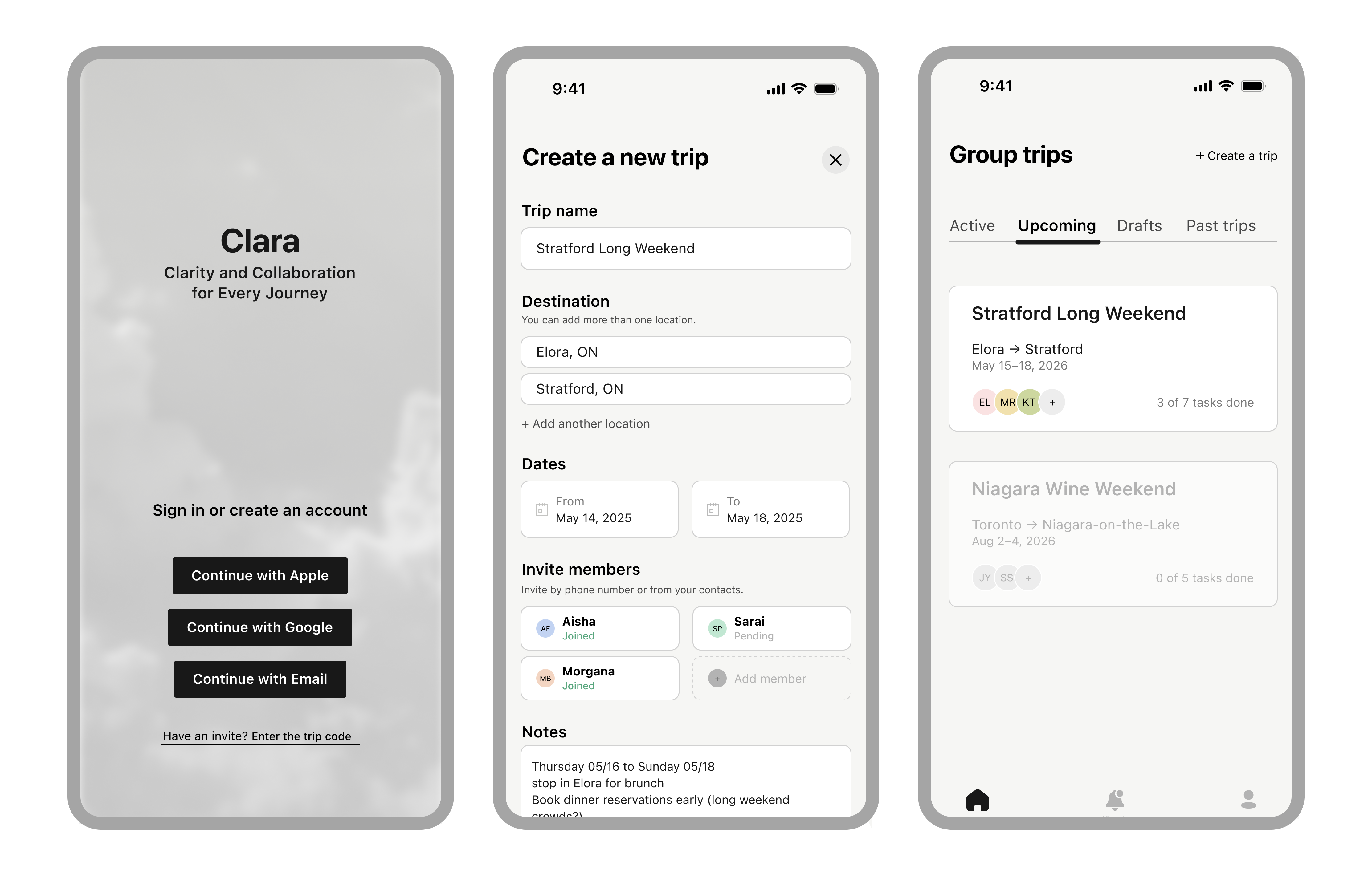
The prototype was validated through task-based usability walkthroughs. Participants were asked to view the trip overview, assign a task, and check progress without guidance. All three flows were completed successfully but the more interesting findings came from what participants did before completing them.

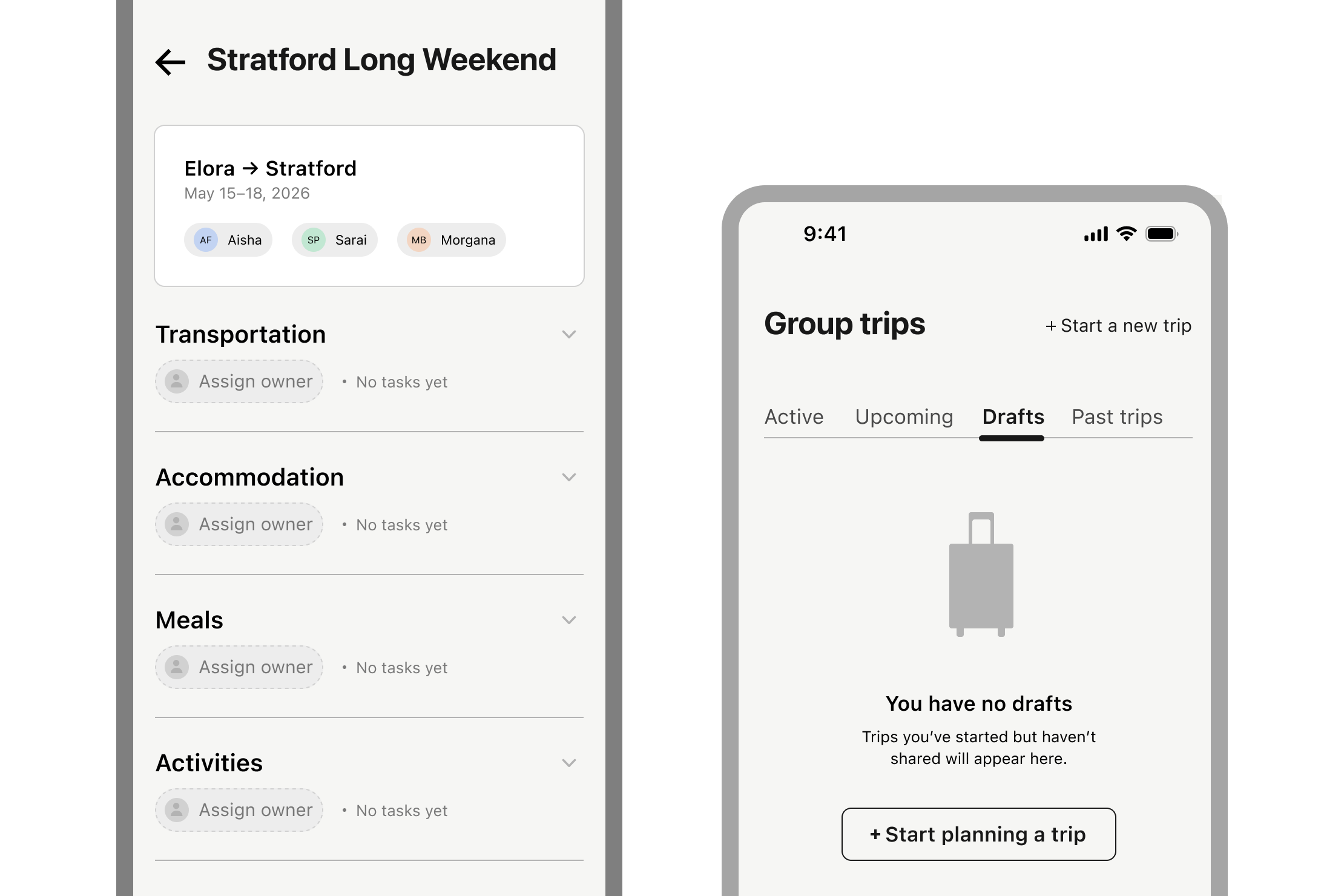
The most significant finding wasn't the icon confusion, which was caught and resolved with text labels. It was what happened when participants tried to create tasks in a group context during testing. Several instinctively wanted to create tasks without assigning them, intending to "figure out owners later" in conversation. This surfaced real tension between the mandatory-ownership rule and the way groups actually plan together early on, when enthusiasm is high and role clarity is genuinely low.

That tension validated the core reframe: the behavior I was trying to interrupt was showing up right in the prototype. But it also made clear that mandatory ownership might need an escape valve — a "needs owner" state that's visually distinct and urgent, not an invisible placeholder. The reframe held. The implementation needs another pass.

Clara demonstrated that reducing ambiguity, not adding features, is enough to change how a group coordinates.

Final Clara screens — trip creation, dashboard, and task assignment
Final prototype screens: trip creation, the shared dashboard, and task assignment.

What I'd Do Differently

Two things testing revealed that the prototype didn't answer.

Introduce a "needs owner" buffer state. Mandatory ownership is the right instinct, but forcing it at creation causes real friction when role clarity is genuinely low. I'd explore a designated unowned state (visually urgent, not invisible) that signals "this gap has been acknowledged and still needs a person." The goal stays the same: no task drifts. The mechanic is gentler, and more honest about how early trip planning actually works.

Design the notification layer. Clara has no notification model, which is a significant gap. Gentle accountability (reminders that feel more like social nudges than system alerts) is where a lot of the coordination behaviour actually lives. I'd design notifications that reinforce ownership without feeling like surveillance: something closer to "your team can see this is due Friday" than "you haven't completed your task."

Next Project

Conserva: A bold, system-driven gourmet experience