lululemon's content strategy and its interface had quietly diverged. The movement content existed, users just couldn't find it. A heuristic evaluation to identify why, and a targeted redesign to close the gap.
lululemon has built a genuinely valuable movement ecosystem, online classes, community events, local instructor-led sessions. The app has the content. The problem is that it's hidden behind membership screens, partner-perk pages, and navigation paths that don't reflect how movement-focused users actually think about the app.
New or returning movement users arrive expecting to find classes. Instead they encounter a home screen that doesn't signal movement content exists, cards that look interactive but aren't, and multiple dead ends with no clear next step. The experience creates confusion and erodes exactly the confidence lululemon's community positioning is designed to build.
Design challenge: How might we redesign the navigation and content hierarchy so that movement-focused users can find, start, and complete a class without hitting a dead end?
What lululemon has
A rich movement ecosystem: online classes, community events, partner content, local sessions.
What users experience
An interface that hides the movement content behind membership layers users weren't expecting to navigate.
Our team audited the full journey, from home screen to class completion, using Nielsen's heuristics and a 0–4 severity scale. The most significant findings shared one pattern: the interface set expectations it didn't fulfill, then left users with nowhere to go.
| Finding | Heuristic violated | Screen | Severity |
|---|---|---|---|
| Movement classes are invisible from the home screen | #7 Flexibility + Efficiency of Use | Home | Level 3 |
| Home screen doesn't signal that classes exist | #2 Match between system and real world | Home | Level 3 |
| Members-Only Experiences page is a dead end — no next steps | #7 Flexibility + Efficiency of Use | Members | Level 3 |
| Featured Partner card implies a full class range; only yoga is available | #2 Match between system and real world | Members | Level 3 |
| "Good Afternoon" looks like a static header but functions as a button | #4 Consistency and standards | Home | Level 2 |
| Top Benefits cards look interactive but are static | #4 Consistency and standards | Members | Level 2 |
| No "class complete" state — the flow ends without acknowledgement | #2 Match between system and real world | Class player | Level 2 |
Within the team's sprint, I owned the Class Detail page and the Class Completion state, the two screens that sit at the sharpest point of the user's movement journey. One is where the decision to start is made. The other is where the experience closes. Both were failing the user in different ways.
The original layout buried the start action beneath product cards and instructor details. A user ready to begin had to scroll past the shop to find the entry point.
The redesign moves instructor context and the start action to the top, product recommendations appear after the class, when they're actually relevant.
The existing flow ended without acknowledgement. Users were returned to the class player as if nothing had happened, no confirmation, no closure, no next step.
Every movement app users (Peloton, Nike Training Club, Apple Fitness+) have a reference point that marks completion with a dedicated moment. lululemon's absence of this state violated a basic user expectation and left the experience feeling unfinished. The redesign adds a clean completion screen: "Class Complete · Great job!" with two clear paths forward: back to classes, or watch again.
Our team's redesign addressed three goals from the prioritization matrix: make classes easy to find, help users choose with confidence, and eliminate dead ends across the movement journey.
The For You screen was restructured so movement content appears immediately (alongside product recommendations) rather than hidden behind separate navigation. Community events were given equal visual weight. Interactive elements were made consistently responsive. Dead ends were replaced with clear next steps.
A high-fidelity redesign across five screens, presented to lululemon stakeholders in December 2025.
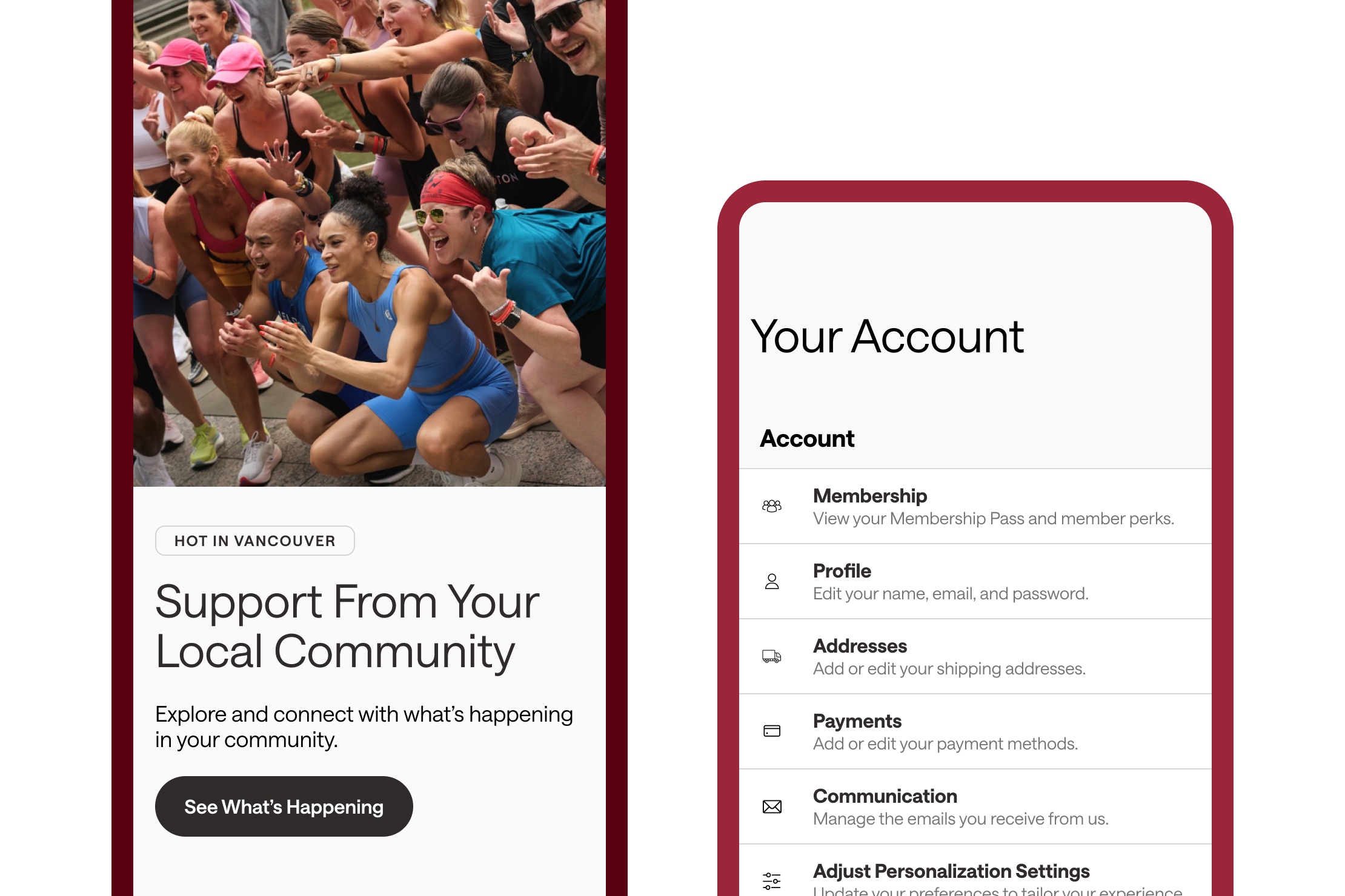
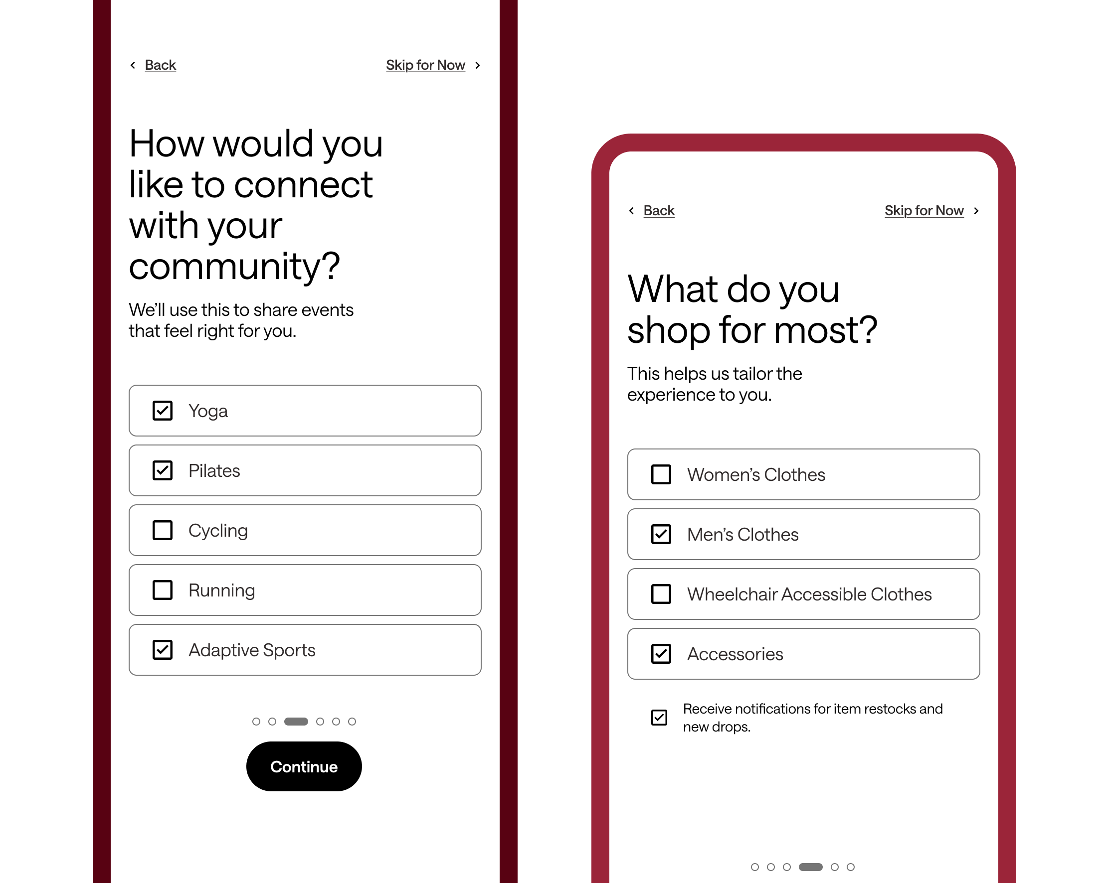
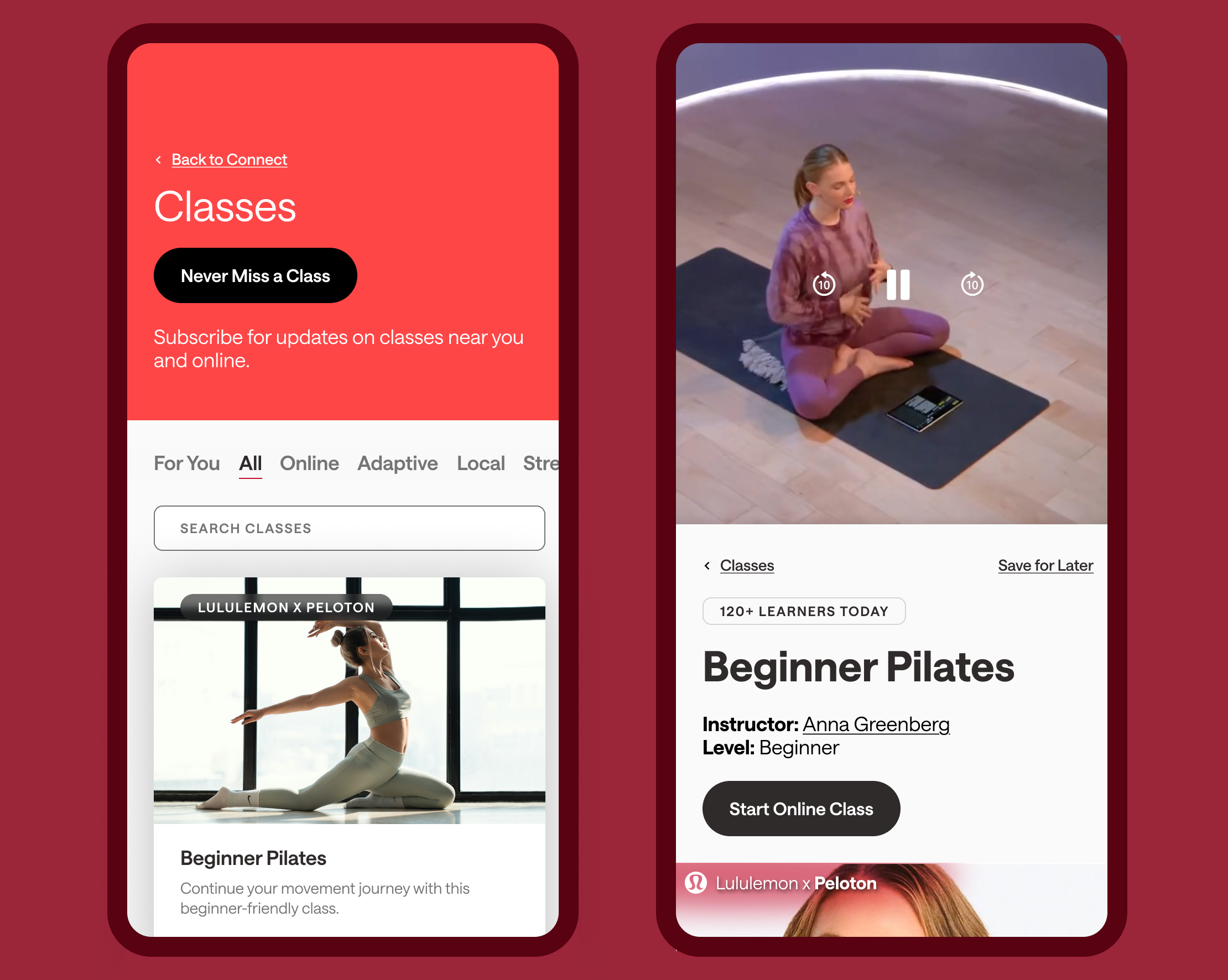
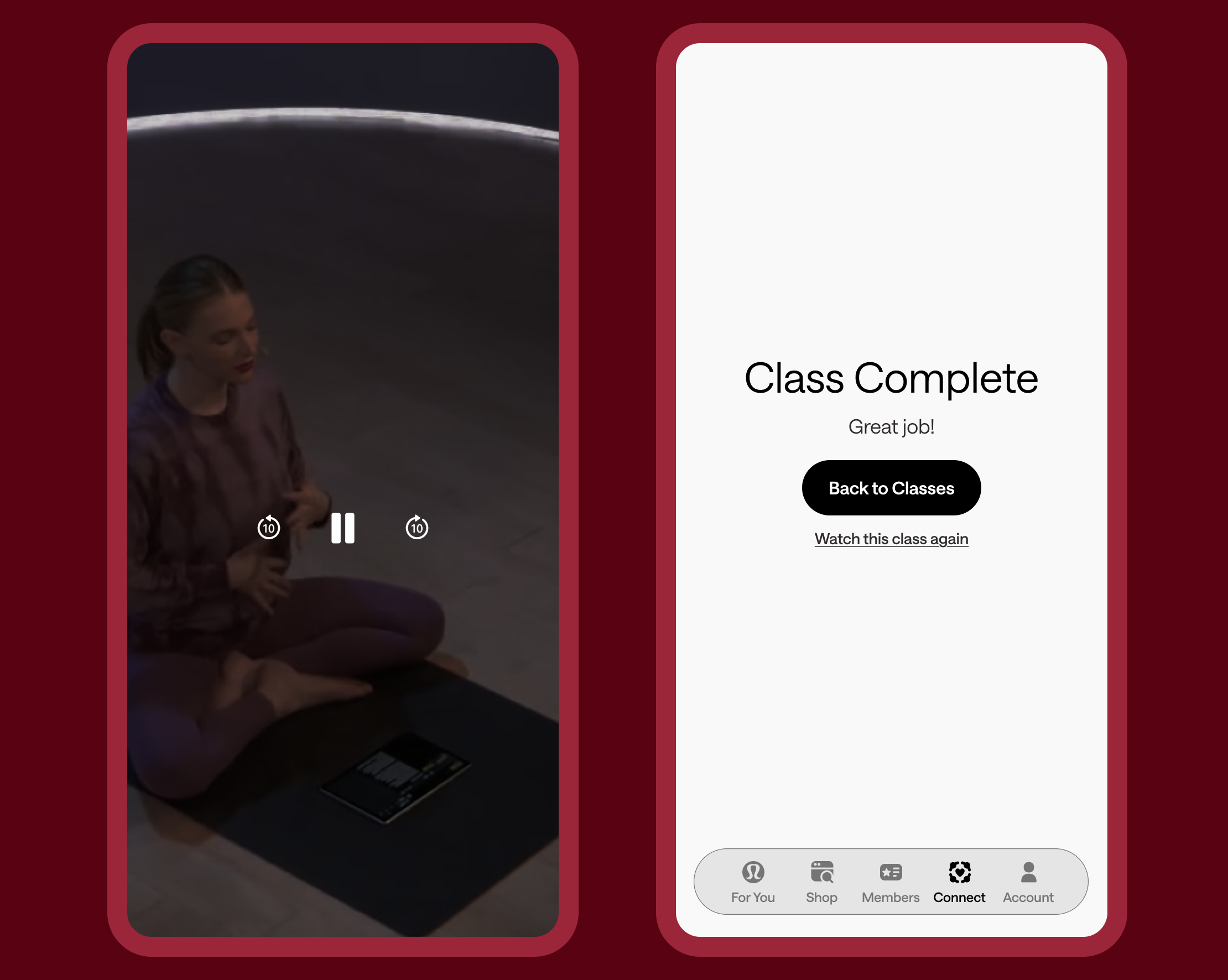
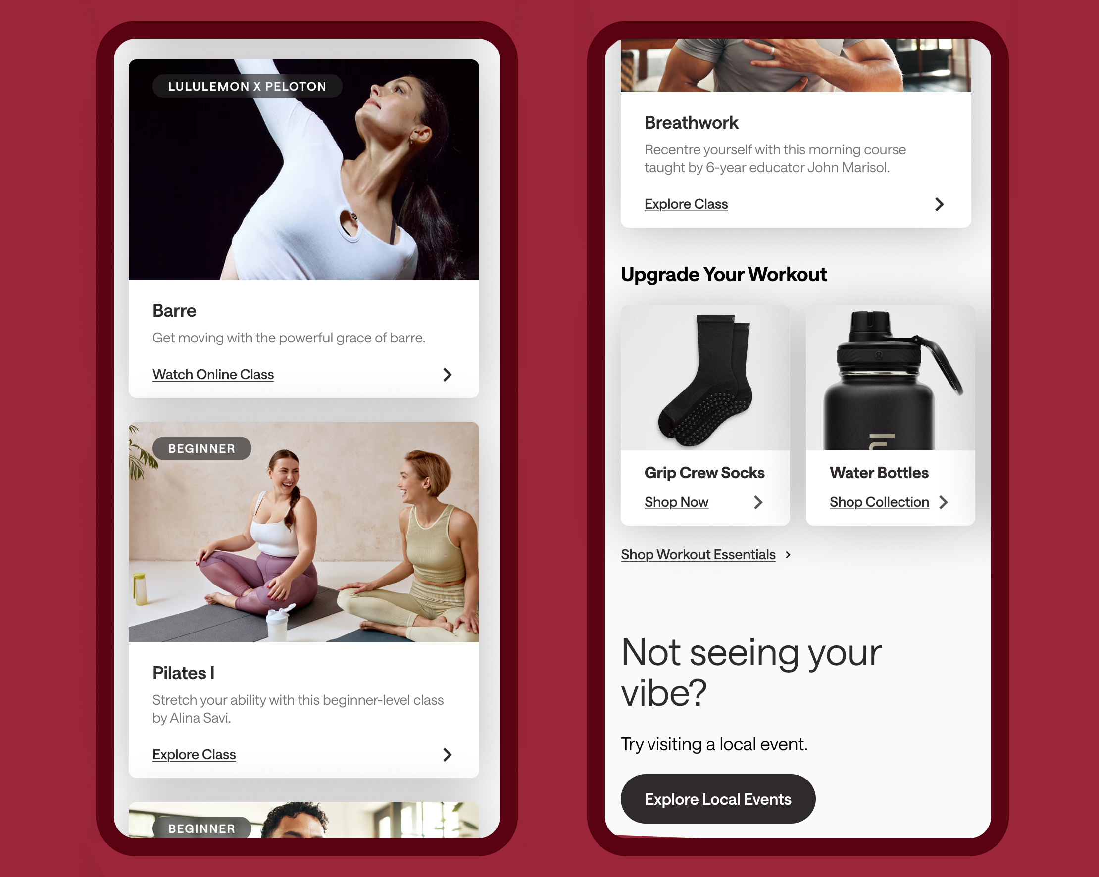
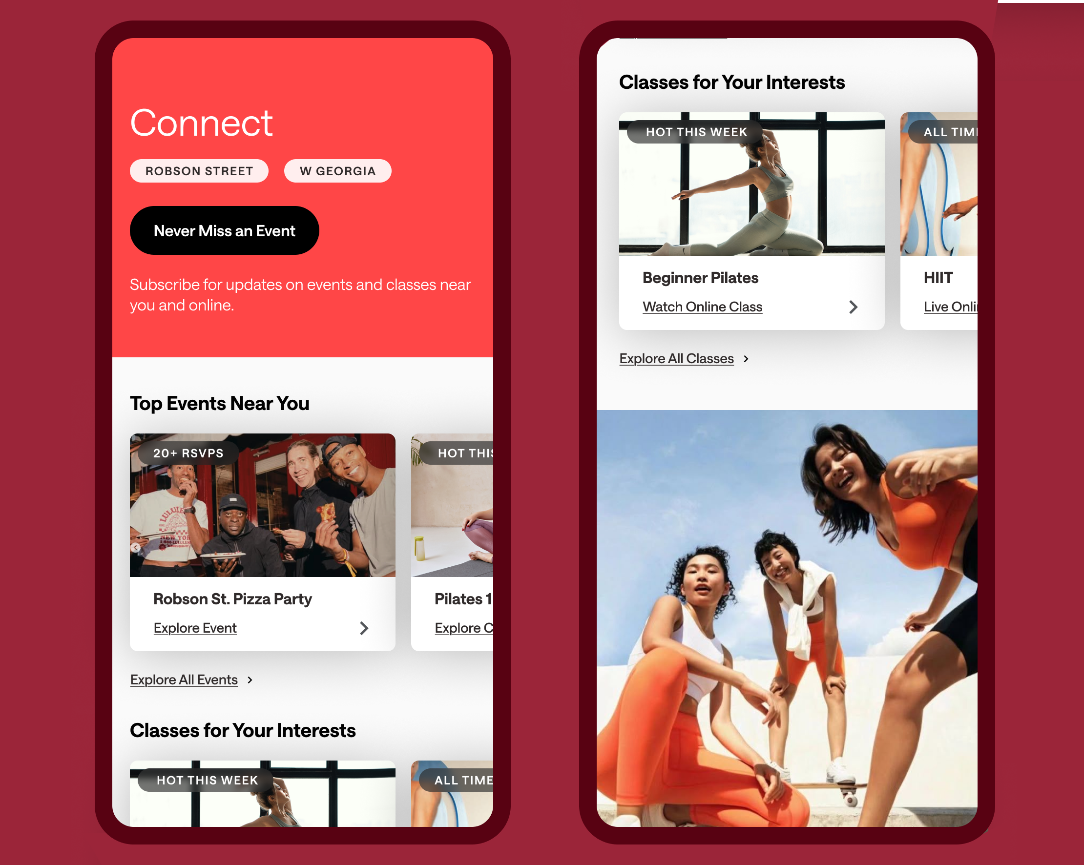
Each change was tied to a specific heuristic issue and severity rating. The work reframed a central gap: the platform holds strong content, but the interface obscures it.
The business case follows directly from that gap. lululemon's movement content isn't a feature sitting alongside its retail model: it's the retention layer. A user who finds and completes a class is more likely to return, more likely to engage with the community, and measurably more likely to convert on product recommendations. A user who never finds the class doesn't build a habit, doesn't return for the next session, and is less likely to participate in the broader lululemon ecosystem. OObscuring the content has a compounding cost that doesn't show up in any single session metric.
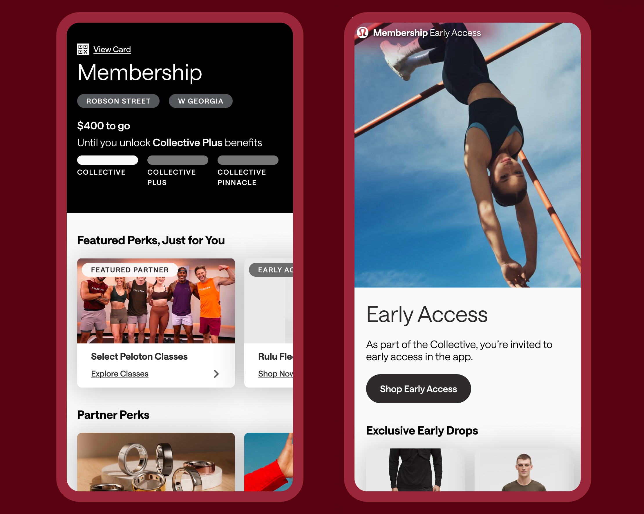
The presentation to lululemon stakeholders was received well. Feedback validated the central finding and opened conversation about the onboarding personalisation flow as a candidate for the next sprint, specifically whether earlier movement preference questions could improve first-session content matching.
What this sprint made concrete is something easy to say in theory: every heuristic violation is a broken promise. The lululemon app wasn't poorly designed, it was well-designed for a version of itself that didn't prioritize movement. The confusion wasn't random. It was the predictable result of a content strategy and an interface that had quietly diverged.
Working on the Class Detail and Completion screens reinforced a principle that’s easy to state and harder to consistently act on: once a user has decided to act, the interface should step aside. Every element that competes with that decision, a product card before the start button, a flow that ends without acknowledgment, is the interface prioritizing itself over the user. The redesign was, in that sense, an act of subtraction as much as addition.
Run usability testing with movement-specific cohorts. The heuristic evaluation was expert-led — it identifies structural problems but doesn’t validate whether proposed fixes actually change behavior. I’d run moderated sessions specifically with users who use the app primarily for classes, not shopping. Their mental models would sharpen several navigation decisions we made by inference, particularly whether surfacing movement content on the home screen changes time-to-first-class for new users.
Explore progressive disclosure for gated content. The current redesign treats Members-Only content as a destination. A longer engagement would let us test whether surfacing a preview of gated content to non-members (visible but locked for example) creates better motivation to engage than hiding it entirely. That’s a product question as much as a UX one, and it would need stakeholder input on lululemon’s conversion strategy to answer well.
Map the full movement user journey, not just five screens. A user discovering lululemon movement content for the first time likely starts outside the app, for example through a social link, a friend’s recommendation, an instructor’s profile. The in-app experience doesn’t exist in isolation. Understanding that full journey would change what we prioritize at the entry points, and might reveal that the onboarding flow is more important to fix than any individual screen downstream.